
Rebranding and developing a new logo to tell the whole story.
Background
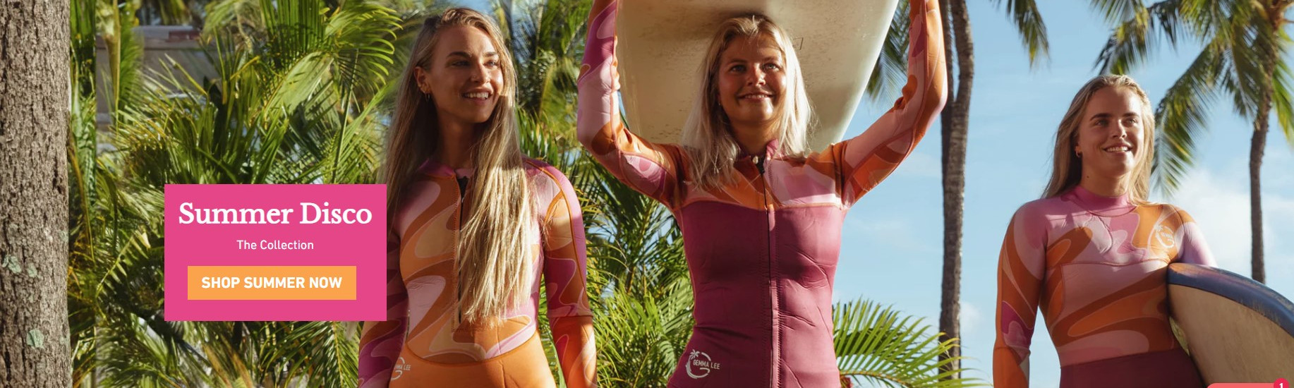
Gemma Lee is a New Zealand based lifestyle brand that manufactures women specific wetsuits, swimsuits and active wear, selling their products online.
When working with Gemma on her marketing strategy and action plan, it became clear her brand was holding her business back and it would benefit from rebranding.
Existing logo
The logo that Gemma Lee was using was light and delicate, in contrast to her bold, colourful designs.
From a technical perspective, having the letter G inside a circle meant that it didn’t scale well and was hard to identify when smaller versions of the logo were needed, especially on the website.
Not having the brand name in the logo also made it hard for anyone who didn’t already know the brand to identify it or look it up online.
From a branding perspective, the old logo had a few issues. In short:
- It didn’t represent the core attributes of the brand.
- It didn’t convey a connection with the sea, or fun, positive lifestyle choices.
- It lacked a distinct feminine feel.
Marketing Services Provided
Having already done a wider marketing strategy and action plan for the business, we had a pretty good understanding of the business. We just needed to focus in on the rebranding and logo aspects. We worked closely with Gemma to pin down exactly what a successful new brand and logo needed to do for her business.
1. Insight Gathering/Discovery Session
Getting the feel and tone of the new Gemma Lee brand and logo was crucial.
We sat down with Gemma and explored the brand vision, key marketing messages, brand position and audience. We also worked hard to discover the ‘vibe’ of the business, what the company and its product meant to Gemma, and what she wanted her customers to buy into when they choose Gemma Lee.
2. Logo Redesign
As well as fixing the issues we had identified with the old logo, the new logo had some technical requirements as well.
It needed to work in several different configurations as a logo and as an easily recognisable icon. The logo also needed to work equally well in black and white, white only and in full colour to be applicable across the full range of Gemma Lee products.
To be ready for the new ‘Sandy Cheeks’ collection, the timeframe was tight for the new brand and logo. We had one month for the initial concept development, refinement, approval, and delivery of final artwork files ready to be printed on new wetsuits and swimsuits.
The initial concepts offered a few different logos, some of which were close to the final choice.
3. Rebranding
As we honed in on the final logo design, the refinement process prompted a further change.
The business was originally called “Gemma Lee Land”, and the logo concepts suggested that for the preferred designs, simplifying the name to “Gemma Lee” worked better. Halfway through the rounds of concept designs, the ‘Land’ was dropped, and after a few minor tweaks, we had the final Gemma Lee logo.
New logo
One of the logos that we proposed in the first round of concepts ticked all the technical boxes, and just as importantly Gemma loved it! A few minor changes and we had the new Gemma Lee logo.