A Branding Shake-Up to Bring Us into the 2020’s
Background
Synthesis Marketing was established in 2001 and after twenty years the branding was looking fairly dated. In 2021, with a new owner and new staff we needed a new logo and general freshen up to reflect our expertise and more diversified offerings.
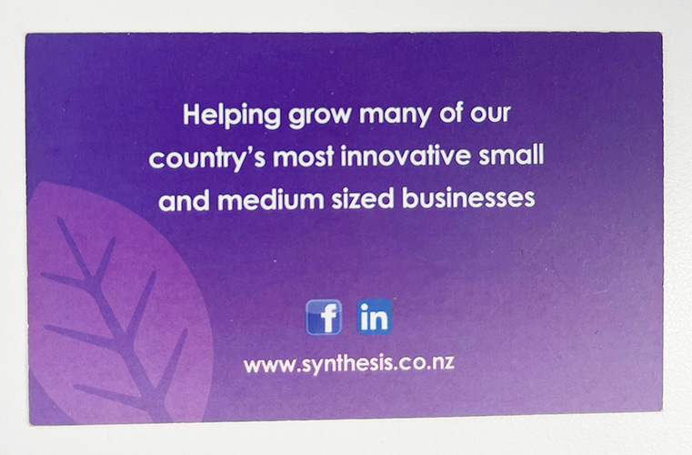
The old logo
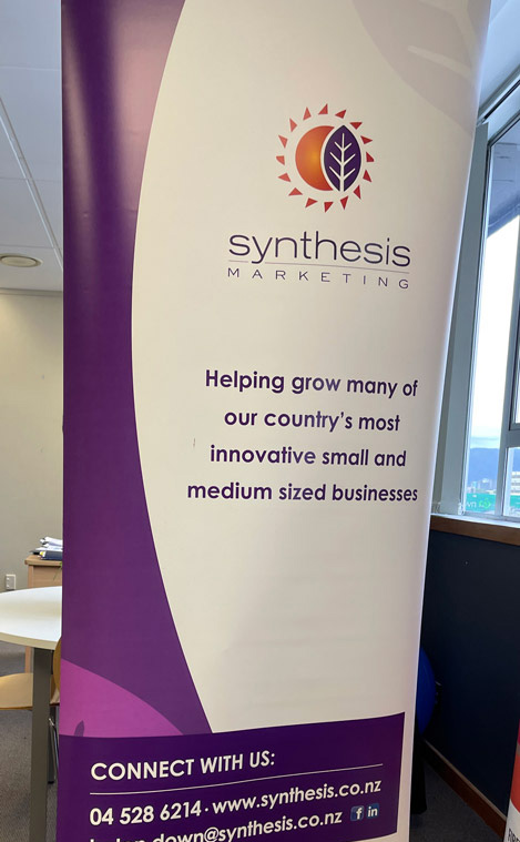
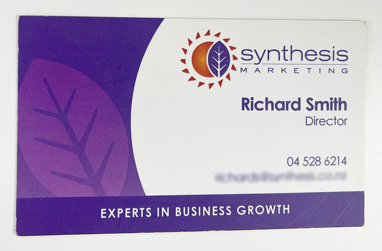
Synthesis Marketing was using a logo that was created in 2001. While it was bright and cheerful, it did not effectively communicate the current tone of the business or the diversity of our service offerings. As a business that designed new logos and provided rebranding services to clients, we needed our branding to showcase what we could do.
A Snapshot of the Old Branding
Marketing Services Undertaken
1. Brand Audit
The first step in the process of developing our new look was a brand audit.
A brand audit is an in-depth look at all the place where logos and branding are used in a business, and how they are used. The results of the audit are a key input into two further parts of a rebrand.
- Knowing where and how a logo is going to be used heavily informs the design process of the new logo.
- The audit list can be used to estimate the cost of rebranding once the new logo is developed, and to make sure you don’t miss anything when you switch to the new branding.
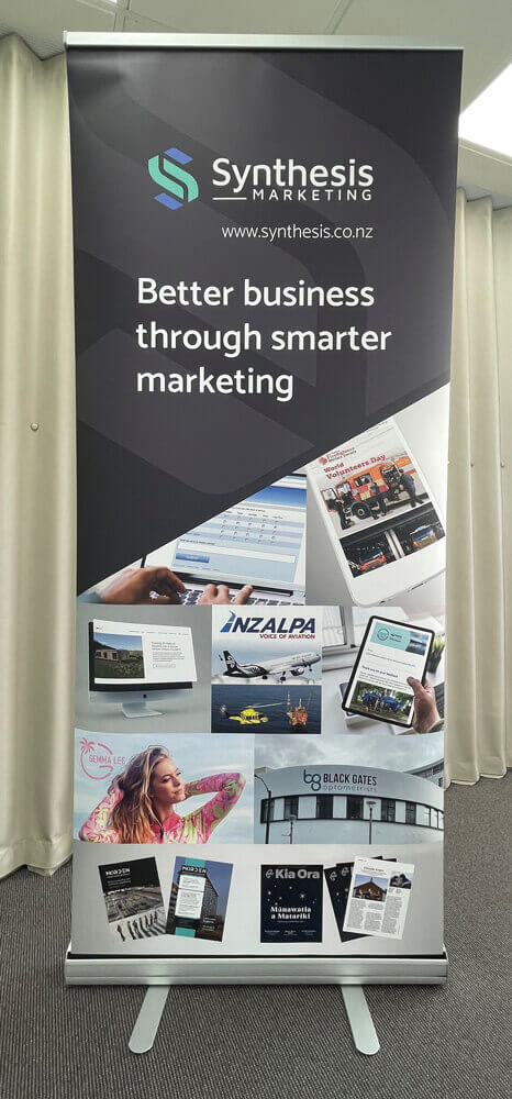
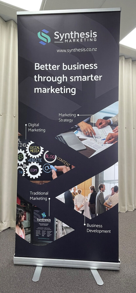
For Synthesis, our new brand and logo needed to work at a range of sizes and scales from online icons through to pull up banners and large window wraps in our office.
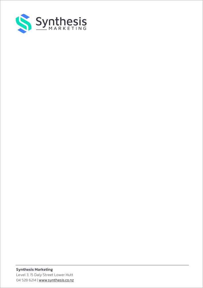
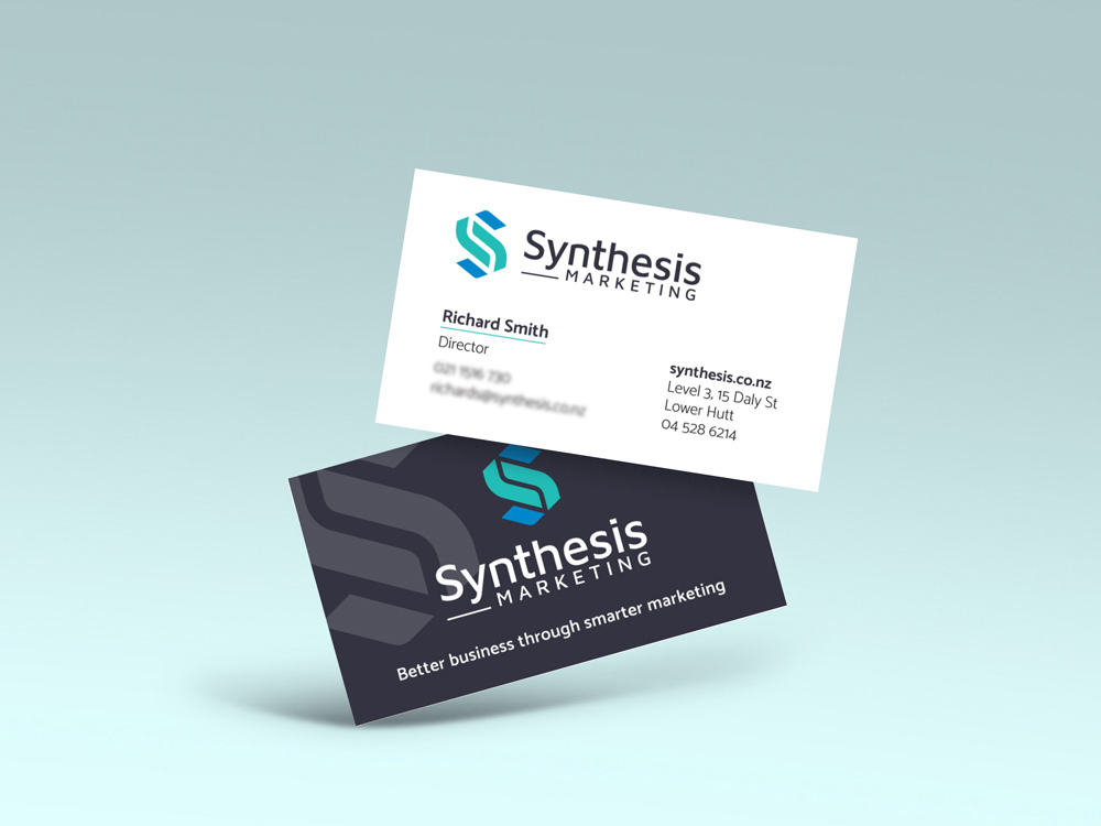
We also had the usual list of office stationery and collateral that was going to need to be included in the rebrand.

2. Branding Brief
A branding brief takes the results of the audit and turns them into instructions for a designer that include:
-
Tangible elements – how and where a new logo will be used, sizes and scales it needs to work at, and any unusually applications.
-
Intangible elements – such as the ‘feel’ of the brand and logo and what you want to convey about the business.
While the Synthesis Marketing team has deep roots in traditional marketing and marketing strategy, we also offers a wide variety of digital marketing service offerings such as video, animation, website design, social media management, etc.
We needed a logo that would work well in all those different applications, We also carefully considered the colours and style of the logo to create an appealing, modern logo that also hinted at digital marketing.
Scale of logo change
Any time we undertake new branding for a client, a key decision is the scale of the change that is envisaged.
Often when we do a rebrand we look at three broad categories of design:
- Designs that are a rework of the existing design, using similar shapes, colours, themes etc. This is often seen as an minor update.
- Designs that are new but retain some elements, such as colour or shape that tie them back to the existing logo. This is more of of a refresh, and works for companies that already have strong brand recognition.
- Blue sky designs that are completely new, and don’t have anything in common with the old logo.
For some clients, concept designs are produced that fall into all three categories, and a decision is made as as a natural part of reviewing the concept designs once we present them.
Other clients effectively make the decision as part of the branding brief, based on brand recognition, their attachment to their existing logo etc.
With all elements of the existing Synthesis Marketing logo looking pretty dated, we decided to go all-out and only look at completely new logo designs.
At this point we handed the brief over to our in-house designer. Luckily for us, designing new logos is a real strength and passion for our designer, so we knew the final results were going to be fantastic.
We took these concept designs and sat down to discuss which ones we preferred, and what aspects we liked and didn’t like about each.
Our designer took all our feedback and used it to edit our top picks, returning to us with a refined concept. After a few more minor changes, we had a final logo we were happy with.
Final branding and logo
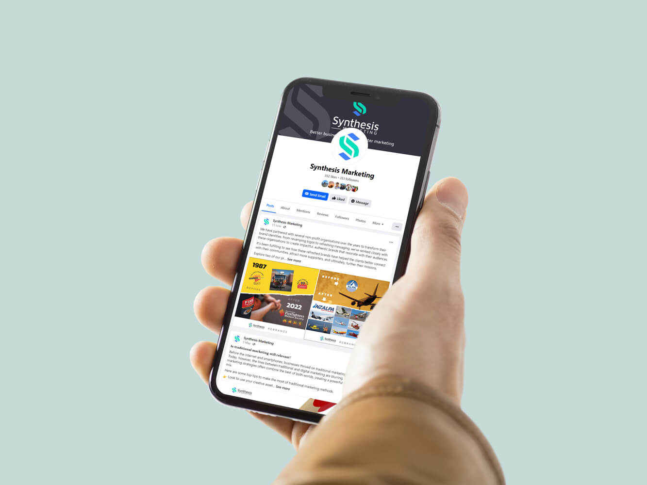
We were really pleased with the final logo and branding. We think it’s clean and modern looking, and better conveys who Synthesis marketing are and what we do.
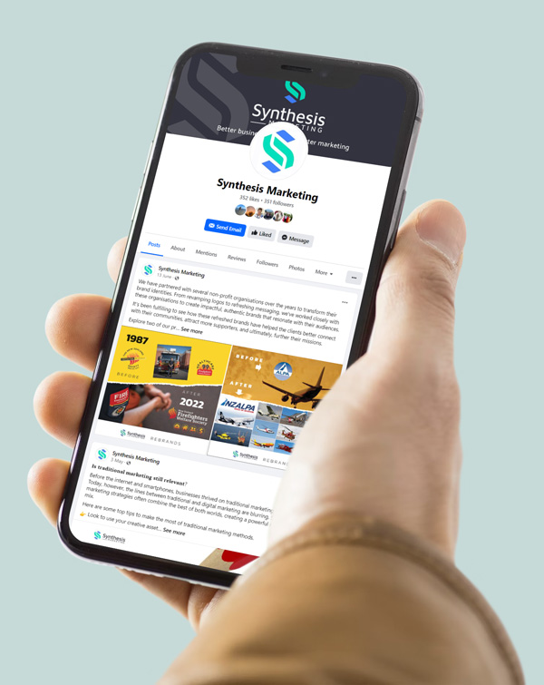
Along with changing all our business collateral over to the new branding, one of the first things we did was to get the logo to an animation specialist. We thought an animated logo would look great on our website, and work well to showcase our business and brand.
The animated logo now has pride of place on the Synthesis homepage, and really helps to bring our business into the 2020’s.