Brand design strategy and rebranding a business and launching a new tech product into the New Zealand market
Background
Smart Office Tech was borne from Smart Office Furniture, a New Zealand based online company selling a full range of office furniture.
Established in 1996, Smart Office Furniture had operated under the same brand name for many years. With a move into selling technology products (beginning with the Xebec TriScreen) they needed a brand design strategy and a rebrand to change the perception of their business to reflect this new product line.
The existing logo

The original Smart Office Furniture brand design and logo was based on a colour scheme and font that was a little out of date. It also included the word “furniture” in a font size that was difficult to read, especially when smaller versions of the logo were used. “Furniture” also now limited the perception of the business, which was moving beyond selling only office furniture.
The logo also featured a kiwi bird, and while this reflected the New Zealand nature of the business, it was an element that had been overused in brand design by many local businesses.
Marketing Services Provided
1. Insight Gathering/Discovery Session
At Synthesis Marketing we place great value on understanding our client’s business from a foundation of “Insight Driven Marketing”.
Deep business insights are crucial for rebranding because the better we understand our client’s business, the better we can match marketing decisions to their products or services, clients, and market sectors.
Our first action was to meet with Smart Office for an initial discovery session.
2. Renaming the Brand
With Smart Office branching out into tech products, a decision was needed about how this was best handled inside their wider brand name of Smart Office.
In discussions with the client, it was decided rebranding was needed to create a main Smart Office brand, with a sub-brand for the tech products.
Based on this decision, we weighed up the applicability of “Smart Office Furniture” as the parent brand. The client agreed that a slight name change was needed.
As a result, the main brand became Smart Office NZ (to replace the kiwi bird from the old logo) and the sub-brand became Smart Office Tech.
The rebranding strategy allowed development of a family of logos that both matched the existing and new offerings, as well as creating room for any additional diversification that may happen in the future.
3. New Logo Development
As our designer worked on the initial concepts, it became clear that a simple design was going to work best, along with a modern and distinctive colour scheme.
As is often the case rebranding we work on, the effort that was put it to insight gathering during the discovery sessions paid dividends. What went on to be the final brand design logos were in the first round of concepts that were presented to the client.
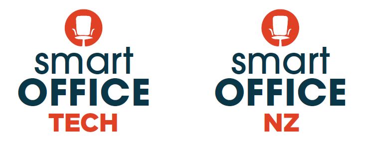

New logo
After discussion and some modifications, the final logos were created.


The final logos ticked all the boxes and they gave the business a fresh, simplistic and modern feel. Clearly belonging to the same brand, the new logos also provided a clear differentiation for the tech offerings.
The logos size well at all scales from small icons on websites right through to larger formats needed for more traditional advertising.
4. New Website
The client’s existing website was dedicated to Smart Office furniture. While the option did exist to simply include the new tech product, the Xebec Tri-Screen, within this same website, the decision was made to build a new website.
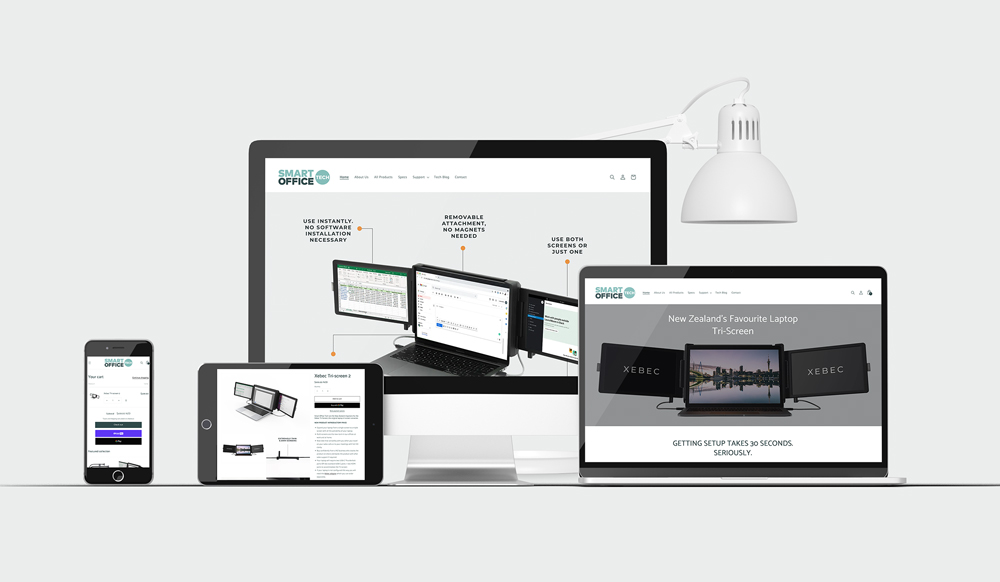
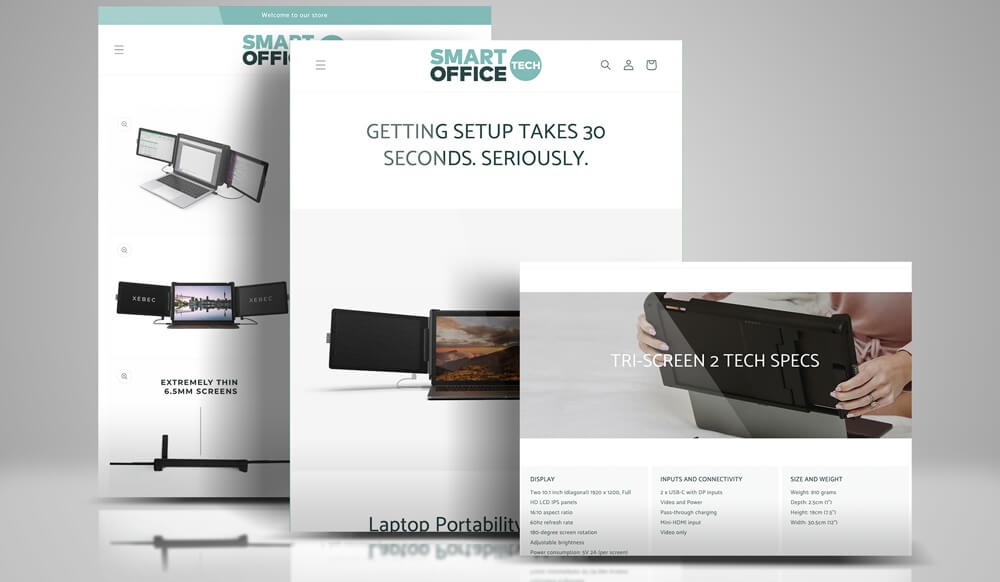
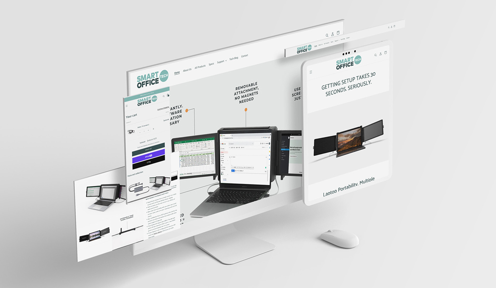
There were a number of reasons to build a standalone website, including:
- Part of the marketing strategy was for the Xebec Tri-Screen to be the first of a number of tech products in a new product line, hence the new logo, “Smart Office Tech”. This new technology line needed to stand alone.
- It was important to the client that this new product gained as much popularity as possible. Having its own professionally designed website gave the product strong credibility.
- Having a dedicated website for the Xebec Tri-Screen meant we could fully search engine optimise (SEO) the site for Google, maximising organic hits.
- Including a blog section and regularly adding new blogs the site, would help ensure the Xebec kept its strong organic rankings.
5. Product Launch to the NZ Market
Next, suitable avenues needed to be discovered and utilised to get this new technology product to the market and sell it.
We identified a number of opportunities to achieve this including:
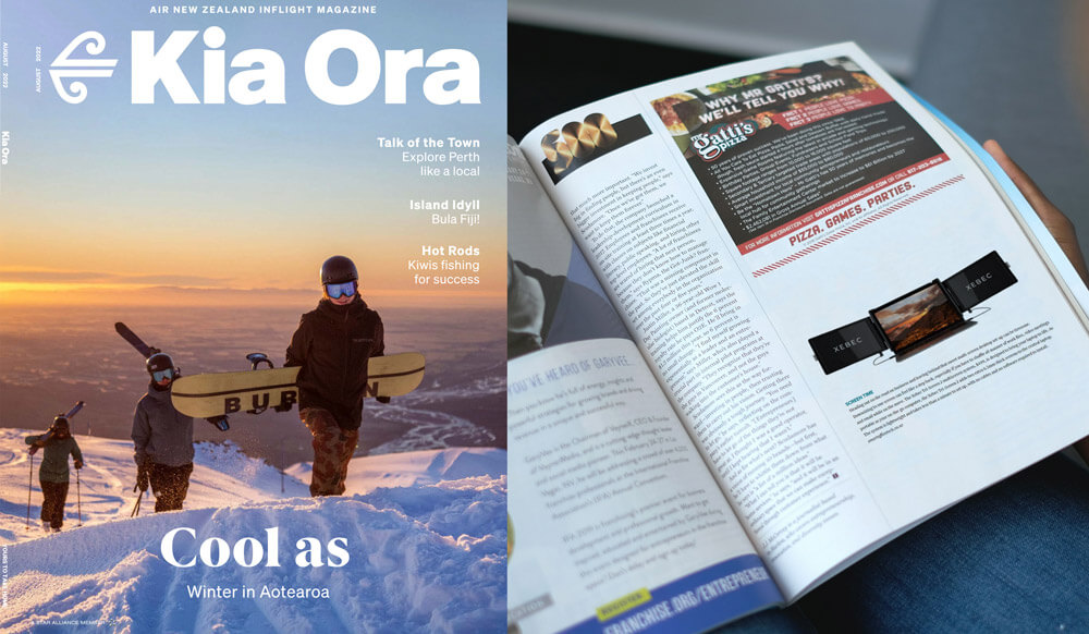
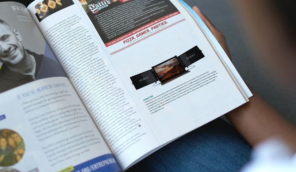
- Media releases to gain free PR, including Air New Zealand’s Kia Ora magazine
- Advertising in relevant publications
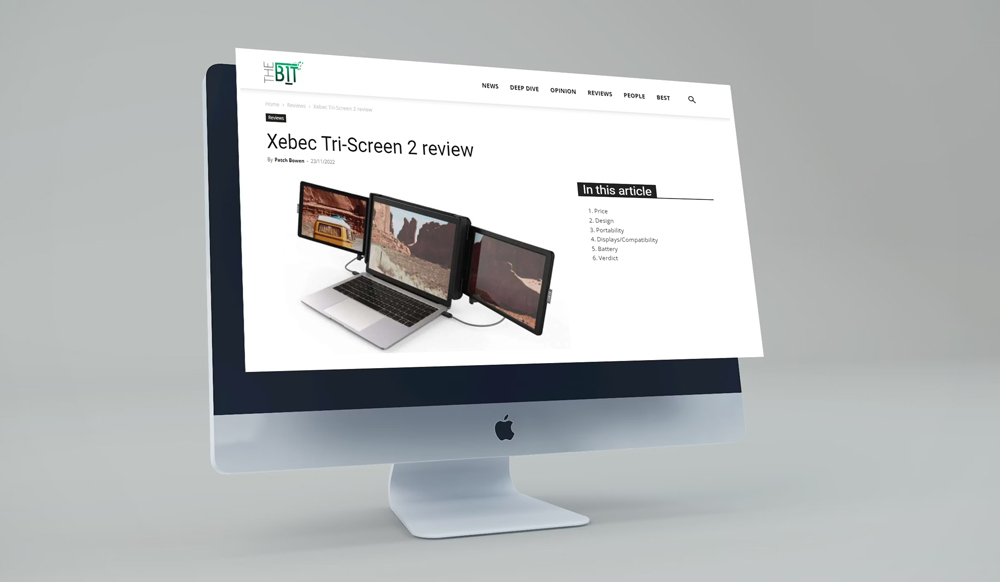
- Tech reviews
- We set up and ran Google Ads
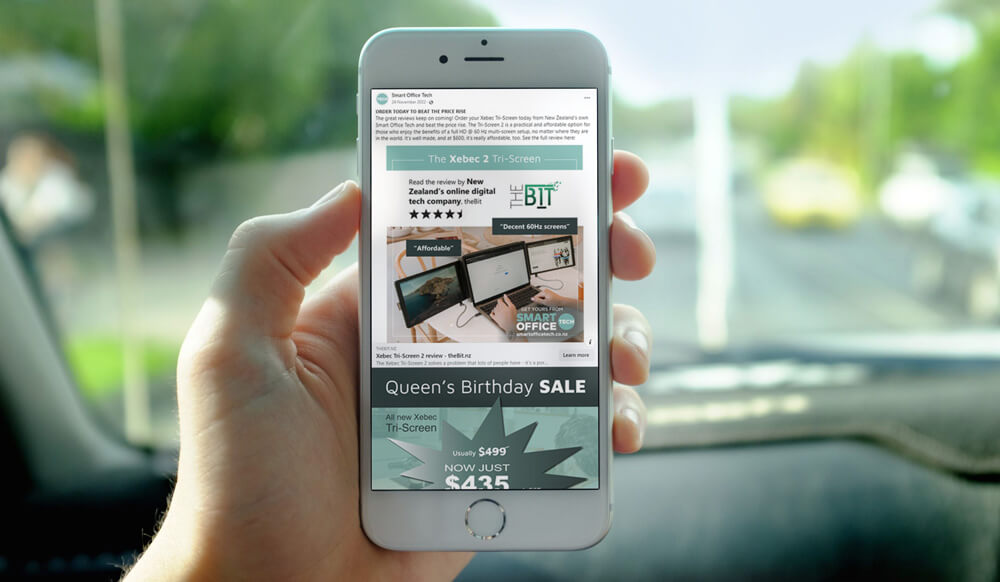
- Promotions through social media.
