
Building a brand around a new logo design
Background
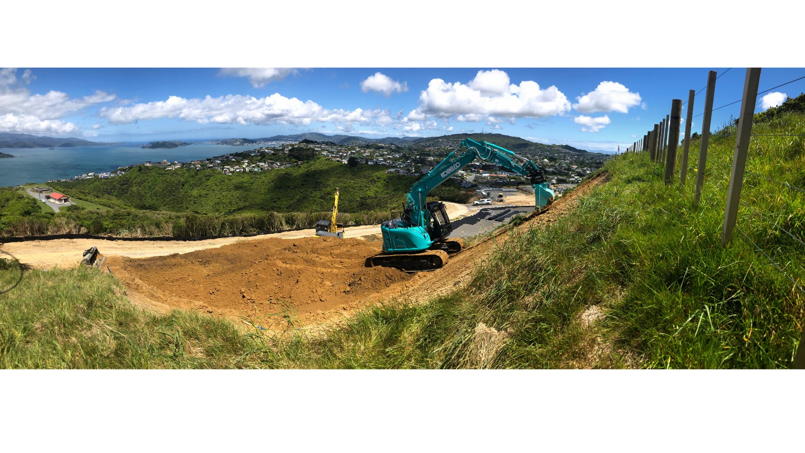
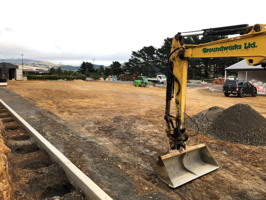
Groundworks are a small earthmoving and civil contracting firm in Lower Hutt.
They had plans to build their brand and grow their company around the Wellington region, but before they could do that they needed a new logo design as a foundation for that brand.
Marketing Services Provided
1. Insight Gathering/Discovery Session
Hamish from Groundworks was typical of many of our clients and came to us for strategy and business development help before ending up with a new logo.
He initially set up a small company in the Wairarapa, offering services to ‘tier two’ civil contractors. These services were to be based on his strong project management skills, especially in drainage services associated with subdivisions. Unluckily, Hamish launched his company just before the first Covid lockdown, and once he could get back to work discovered that many projects that would have benefitted from his expertise had been cancelled or put on hold.
Our initial work with Hamish was focusses to strategic planning and business development, and we explored growth options including organic growth, buying into an existing civil contracting firm as a partner, or buying a civil firm outright.
The next major meeting we had with Hamish, he’d worked through the options we had discussed, and was a partner in Groundworks, an existing Civil contractor in Lower Hutt.
2. New Logo Development
With a new partner onboard, and a new set of skills to market, Groundworks updated their name to Groundworks Civil Contractors, and needed a new logo to go with it.
When they came to us, Groundworks had put a lot of thought into what they needed and wanted from a new logo including a logo that:
- felt familiar and had good continuity with their old logos,
- was a modern evolution of old logos,
- used their new name, without ‘Limited’ or ‘Ltd.’,
- had a primary focus on ‘Groundworks’ and a secondary one on ‘Civil Contractors’,
- be bold, simple and green (their company colour),
- with or without a shadow (as with their previous logos),
- with or without the symbol that looked like a road on their old logos,
- not have anything related to diggers or earthmoving equipment.
They also knew where they needed their new logo to work, an important factor when in the design phase. This was especially the case when going from small digital applications right through to the large formats needed for machinery and buildings.
Their previous logo design
Over the years, Groundworks had reworked their logo design a few times, and at least five versions of their logo were in use at the same time, in different places, when they came to us.
Some logo design versions looked quite dated, and displayed the company name as Groundworks Limited, or Ltd. Most were for Groundworks Contractors but didn’t explain what sort of contractors they are.
Revitalization phase
We put together several draft logos for Groundworks to review through the first round of ideas. It’s a testament to our designers that they were really enthusiastic about the font and layout of the draft logos.
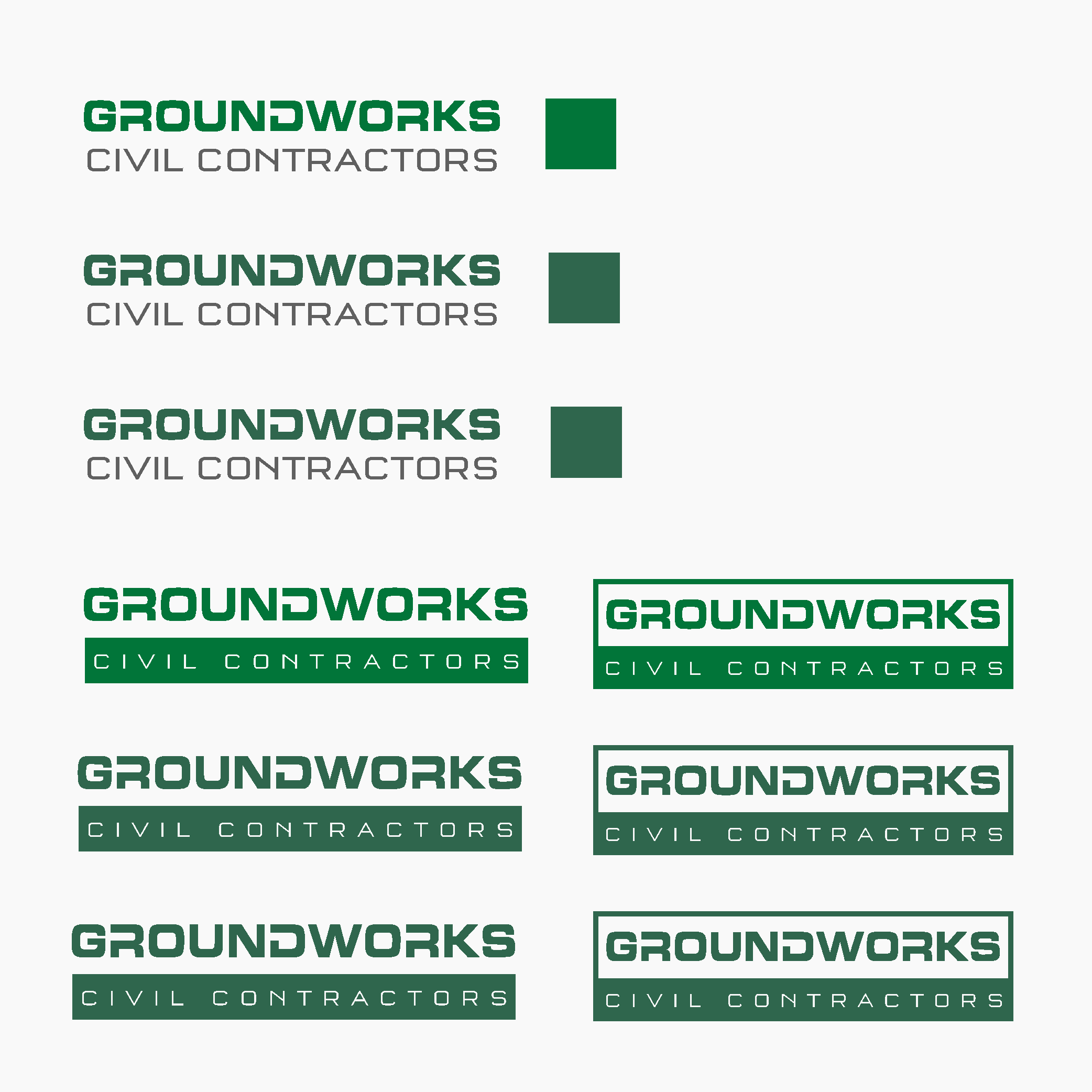
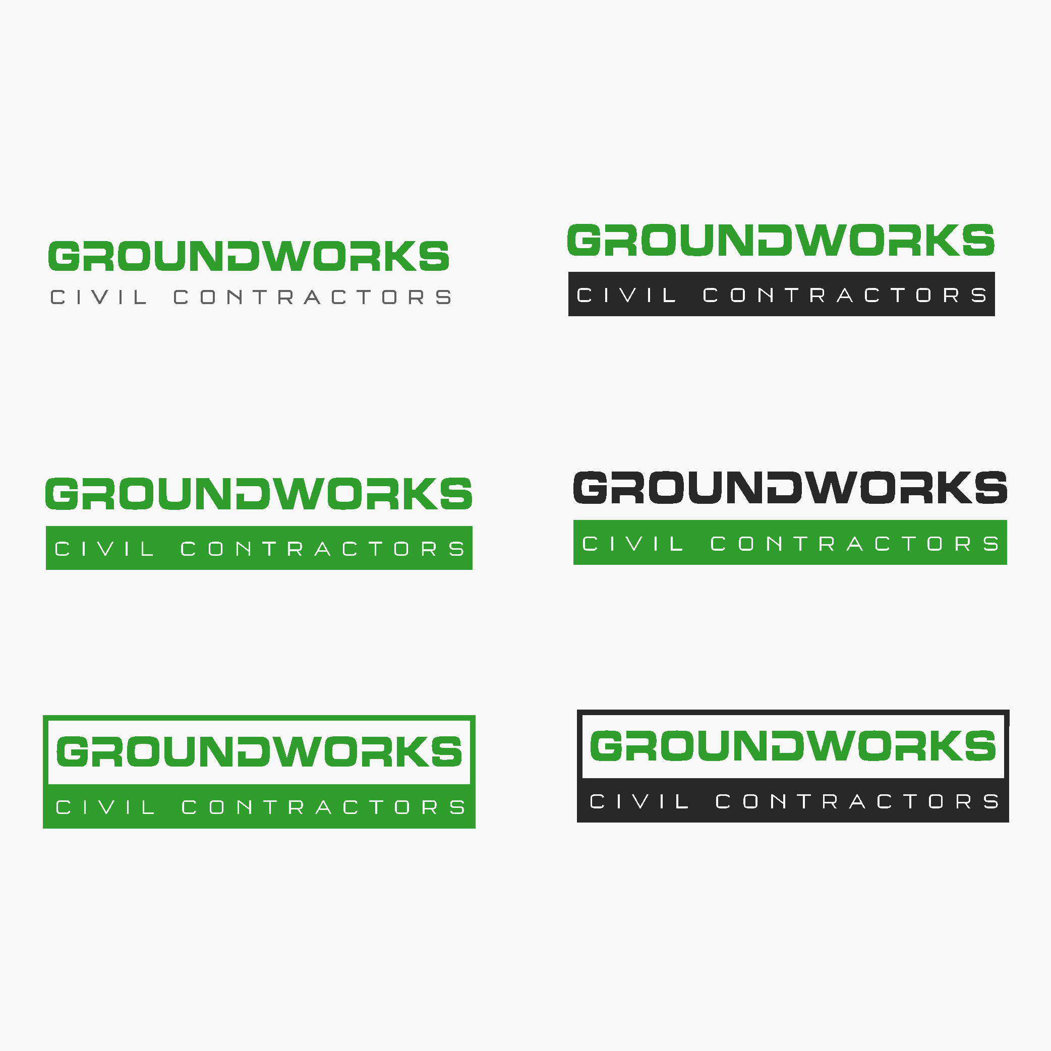
Final logo
With further alterations to the chosen concept design and some examples of this option in use across multiple applications, we had something that they loved.

Why Choose Synthesis Marketing?
Hamish from Groundworks took advantage of the full service support that Synthesis offers to clients. What started out as business strategy and business development advice ended up with the development of a new logo to pull a brand together. When Groundworks face their next marketing challenge, we’ll be there to offer them the support they need.